Kunst im Kopf - Deutsche Oper Berlin
An interview with Christoph Niemann
Art in mind


The FAZ has described Christoph Niemann as “the best illustrator of our age”. Many works by Niemann have achieved international celebrity. The path to fame of the Swabian native (*1970) included a move to New York, where he has worked for “Rolling Stone”, “The New York Times” and “The New Yorker”. Christoph Niemann returned to Berlin in 2017
Mr Niemann, what were your thoughts when you got your first glimpse of the façade of the Deutsche Oper Berlin?
I’m from Stuttgart, and the opera house there is still an old building with classical architecture. But it was many years before I actually saw the inside of an opera house. I went to New York after college and was often kicking my heels in the evening, so I started buying cheap tickets to the Metropolitan Opera. Its parent building, the Lincoln Center, was built in the 1960s and conveys an impression of opera quite different to the aura given off by a classical building. The Deutsche Oper Berlin, on the other hand, I only knew from driving by it all the time - a monolithic edifice in the Bismarckstraße, which probably would have frightened me as a kid because of its brutalist architecture. Today I think the building’s amazing. Ok, it’s quite severe in its shape, but its structure with the exposed concrete and the lettering on the outside is characterful and has soul and a self-assuredness.
Do you think this severe style fired your imagination more than a historic building bulging with adornments would have?
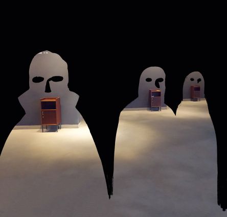
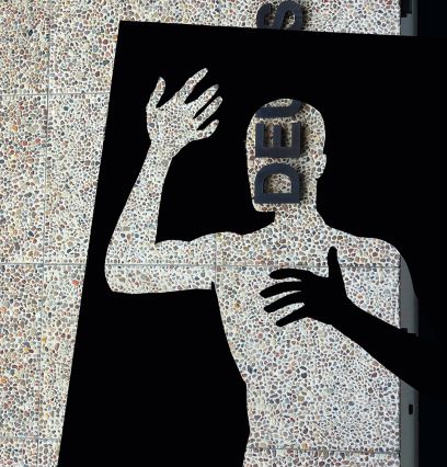
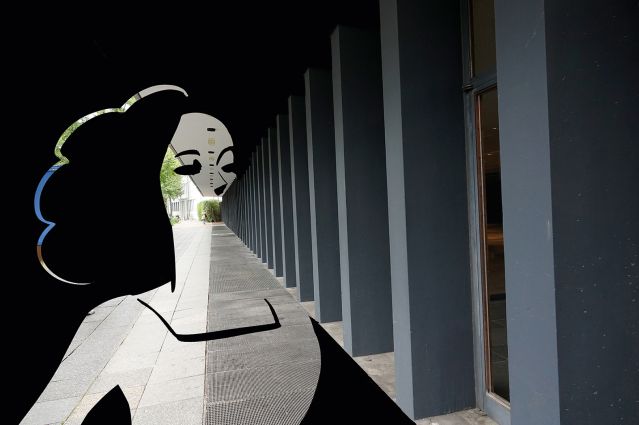
Obviously, from an artistic point of view the Deutsche Oper Berlin is a more rewarding venue for my purposes because the building’s various features give me space to chill out and think in. The building has large surfaces that I’m trying to redefine with my pictures.
For your pictures you looked the building over from top to bottom and shot hundreds of photos. How do you go about choosing things to photograph? Do you know at once what kind of drawing it’ll be?
First of all, it was important for me to spend some time in the building, get to know the people who work here and shoot some pictures. When I take photographs, I don’t even try to think about that kind of stuff. It’s usually counter-productive. Which is why I shot as many photos as I could early on and then took my time mulling over the results. The first phase has to be short, though, because your real-life impressions have to stay sharp. The ideas don’t start occurring to me until I’m sitting at my computer and going through the photos one by one.
Your works are also your interpretation of opera. Do they reflect you as a fan or as someone who is just curious?
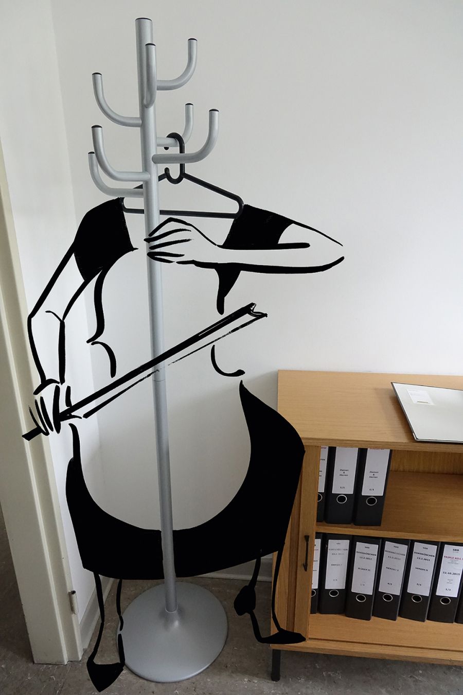
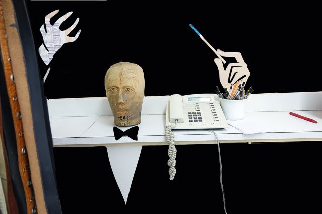
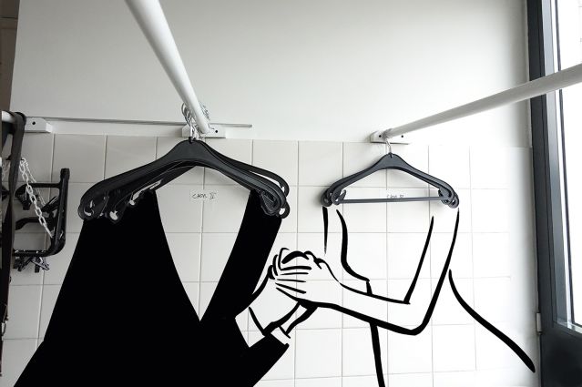
I’m no expert on opera. And if you ask me, that’s a big advantage, because it’s all about communicating with the audience. I go to the opera as an interested, open-minded person and try to draw pictures that work for exactly that type of person. I believe that, at the end of the day, art, music and literature are only created in the mind of the observer. Even if I have a huge production onstage, with 500 people marching around sawing on violins and blowing trumpets, at the end of the day everything happens in the mind of the observer. That means my function is actually just to provide keys and codes, my own experiences, mixed with the new stuff I’ve registered at the opera. I don’t look at the clothes rail and think, that one looks like a cellist; my pictures are like dominoes that I tip over to trigger emotions and thoughts. The only way I can make a cellist out of a clothes rail is if both components – furniture and musician – are basically known to the observer. The new thing that is created is the link between the two.
For you, when does a photo work as the basis for a drawing?
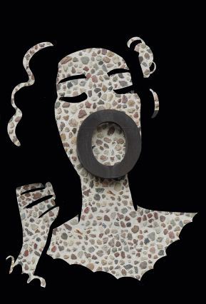
Actually the photos should always be telling stories, and only 60 or 70 percent of each story is worth something. Something has to be missing, a bit like an anecdote that’s missing a punchline or dénouement. And then the picture has to leave scope for the illustrator to round it off. The drafting process is when I realise how much extra sketching-in needs to be done. The illustrations have to be executed in a dashed-off manner, because the authority of the photos is already prescribing architecture and structure. If the illustration is too close to real life, the line between the two worlds begins to blur. Sometimes haste and spontaneity in a pencil stroke is more powerful and effective than nicety and tentativeness.
As if the illustration is adding a spontaneous thought to the reality captured?
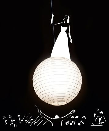
The response at first glance should be: “Yes, of course! That’s the soprano standing on a luminous planet.” On closer inspection I should be realising: “Actually there’s not nearly enough information there for me to ‘get’ the picture – but somehow it still works.” That way I realise that it’s actually me, the observer, doing the work in my head. This is what I demand from my observers.
Is using opera as a theme rewarding for an illustrator?
As a rule, opera as a visual oeuvre is absolutely impossible. Actually it couldn’t be less rewarding, because with opera the eyes and ears have already feasted: there’s no room left, no need to try and add a little extra something to the visuals. Which is why I knew from the get-go that if my approach is going to be visual, then my search for motifs is over the moment the curtain rises. All my pictures show goings-on in the forum, in the foyer, backstage in the make-up room and costuming. I show pretty much everything but what opera is really about.